Volunteer Wellington: Finding the path to purpose
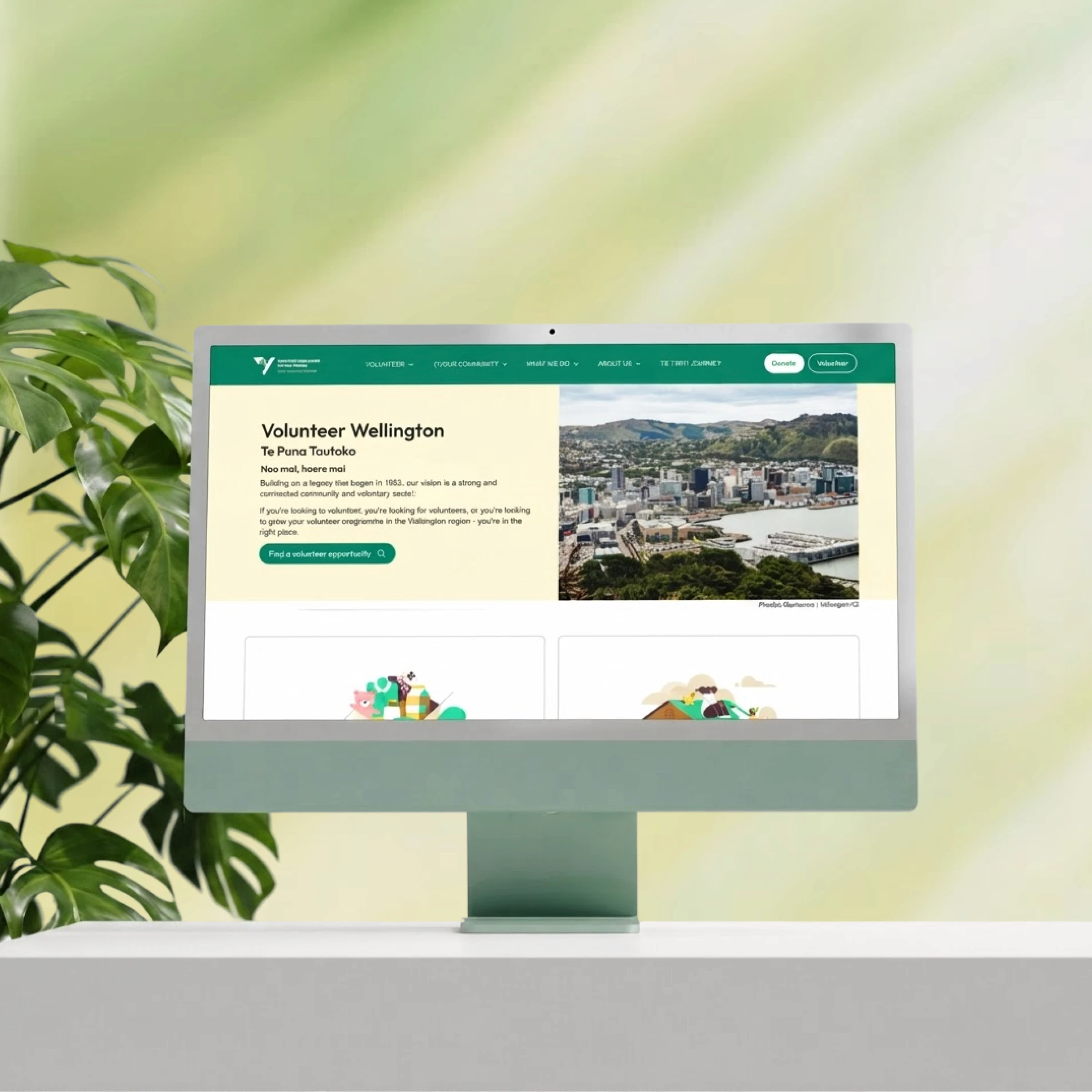
79% of visitors left without viewing a single role. I redesigned the flow reducing 4 clicks to 1 making it easier to find the opportunity.
Client
Industry
Skills
Timeline
Context
/Overview
1.1
Volunteer Wellington had the traffic. The website was losing it.
Volunteer Wellington(Te Puna Tautoko) supports over 300 community organisations and handles more than 4000 volunteer enquiries annually, connecting individuals with meaningful roles.
The website had grown organically over decade. It had the traffic, but the design was working against the organisation's mission: connecting people to purpose.
79
%
Left without viewing a single role.
63
%
Viewers went no further than the homepage.
1.1
%
Low traffic from email.

1.2
What success looks like
The requirements are to deliver a modular, accessible, and community-driven website.
Make it easier to find and sign up for roles
A user-friendly interface for volunteers to browse, filter, and sign up.
Reduce bounce rate and improve time-on-site
Better navigation and content clarity to keep users engaged
Improve accessibility across devices
WCAG compliance, screen reader support, and a mobile-first responsive layout
1.3
My role
As the sole UX/UI designer, I led the end-to-end redesign from research to wireframes, visual design, and a reusable design system. Every component was designed to map directly to Drupal so the VW team could build and manage pages independently.
Component design for Drupal CMS
Responsive Design
Brand Refresh
Final Outcome
/Delivery

2.0
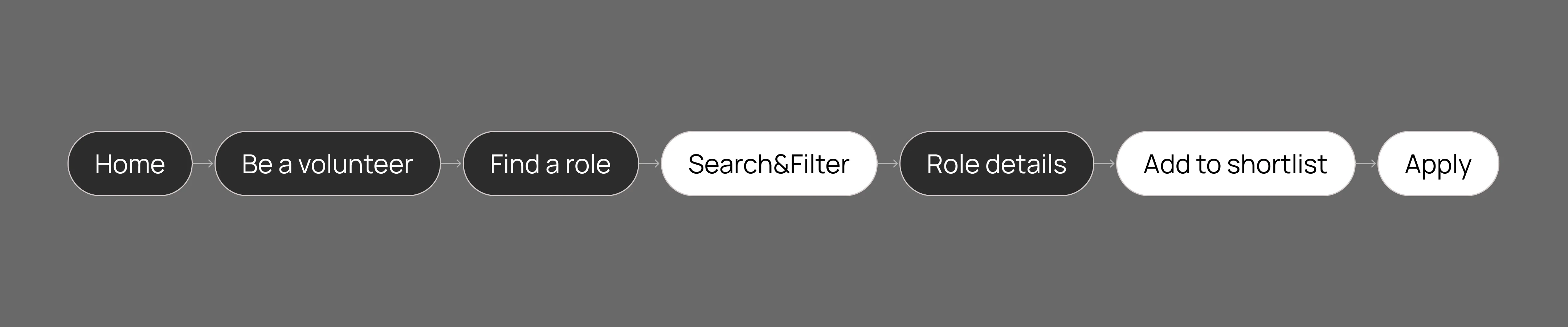
How the journey changed: From 4 clicks to 1
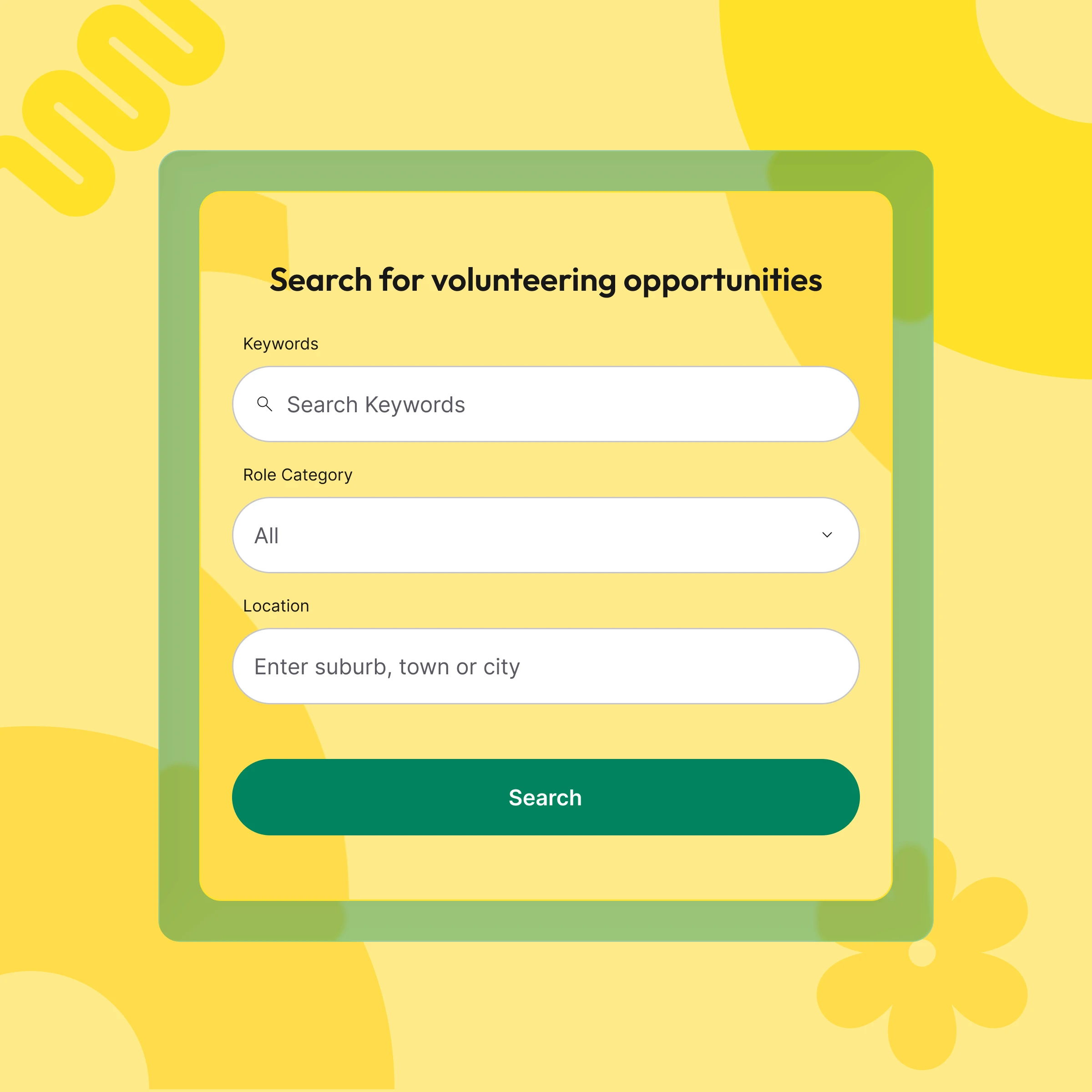
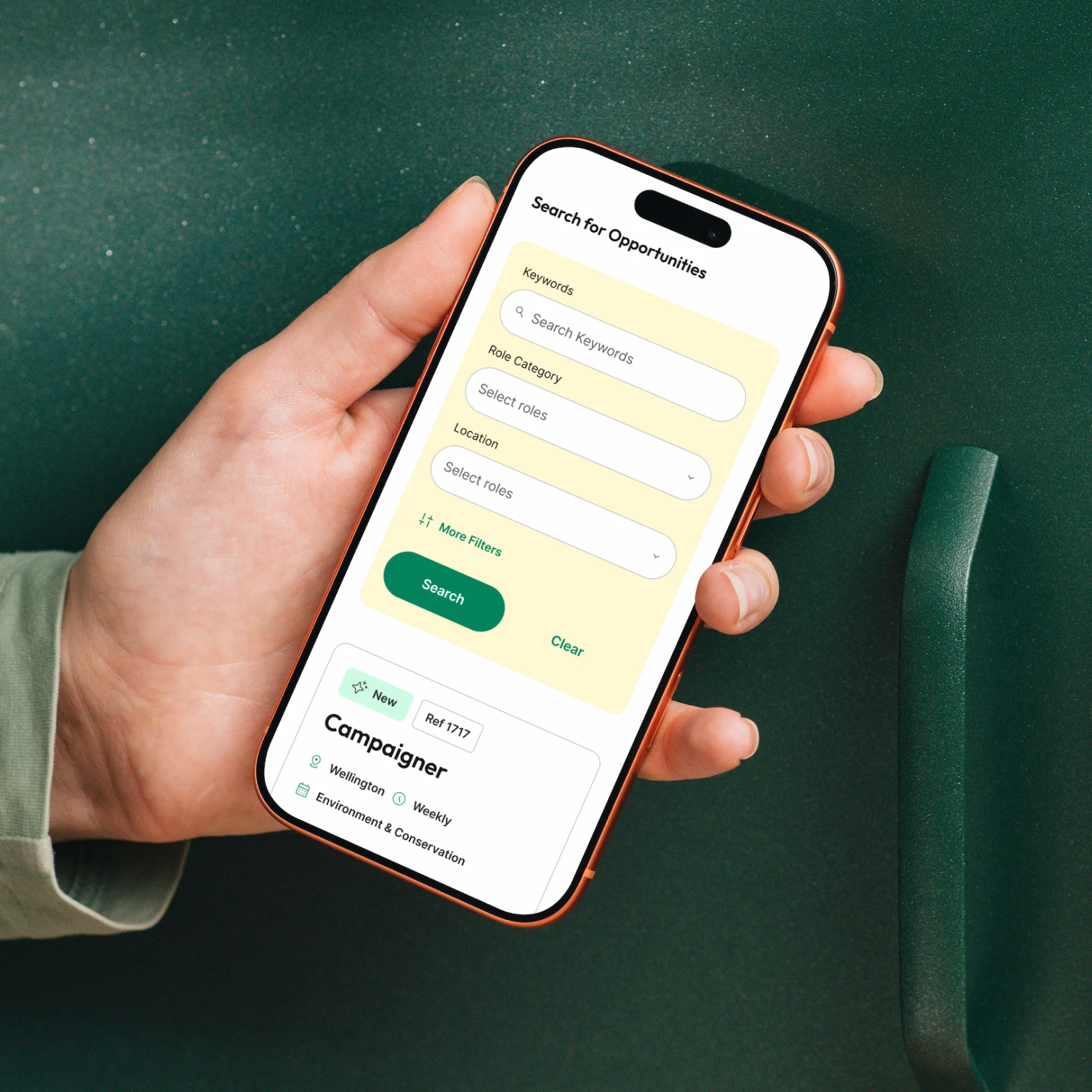
The old site required users to navigate multiple pages to finally browse roles. The redesign embeds search directly and users can find a role in a single action.
Before
After

2.1
Clear pathways by audience
The old site wasn't clear which content was for which audience. The redesign addresses this at two levels: audience tags and restructured navigation that tells users what they'll find before they click.


2.2
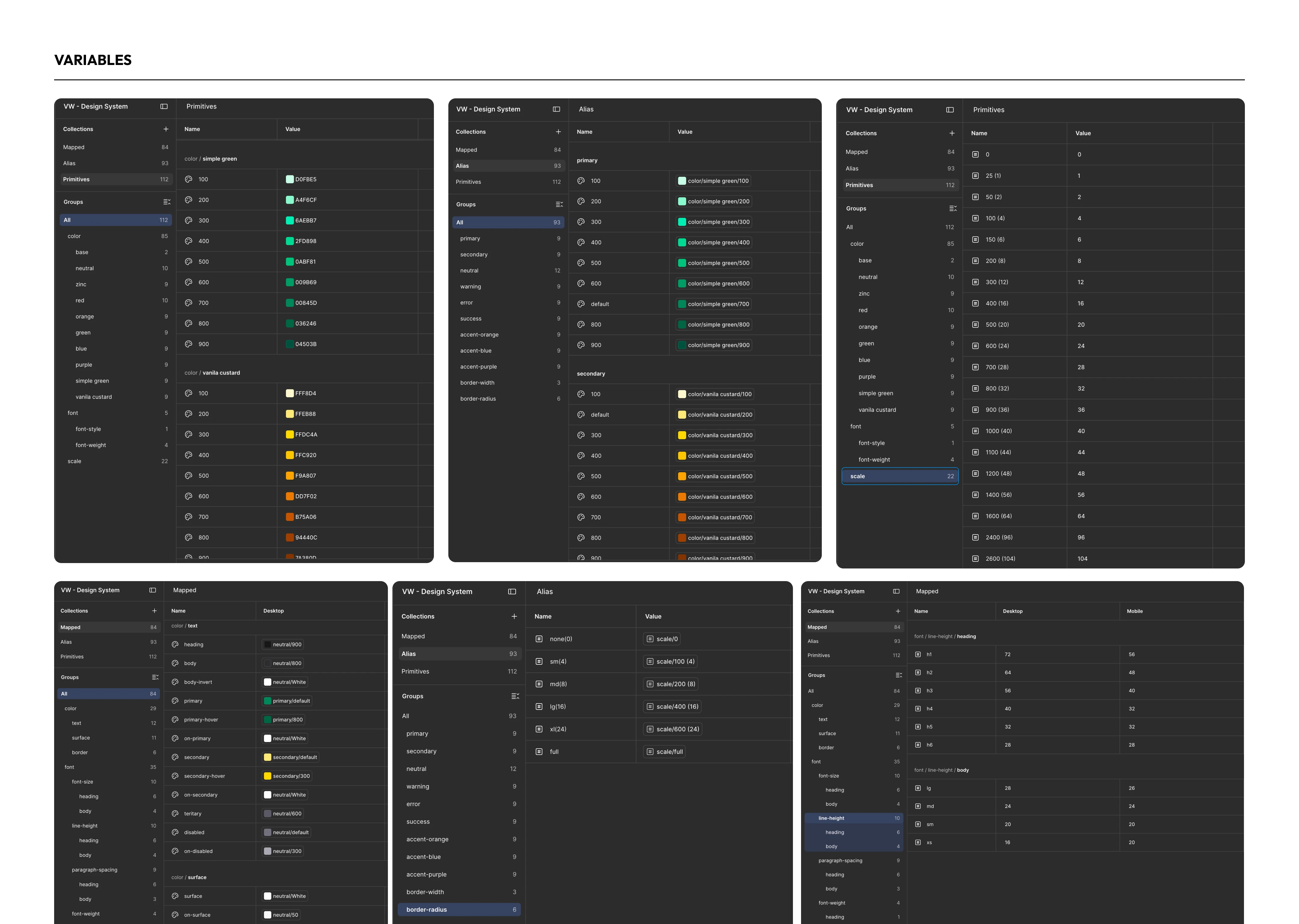
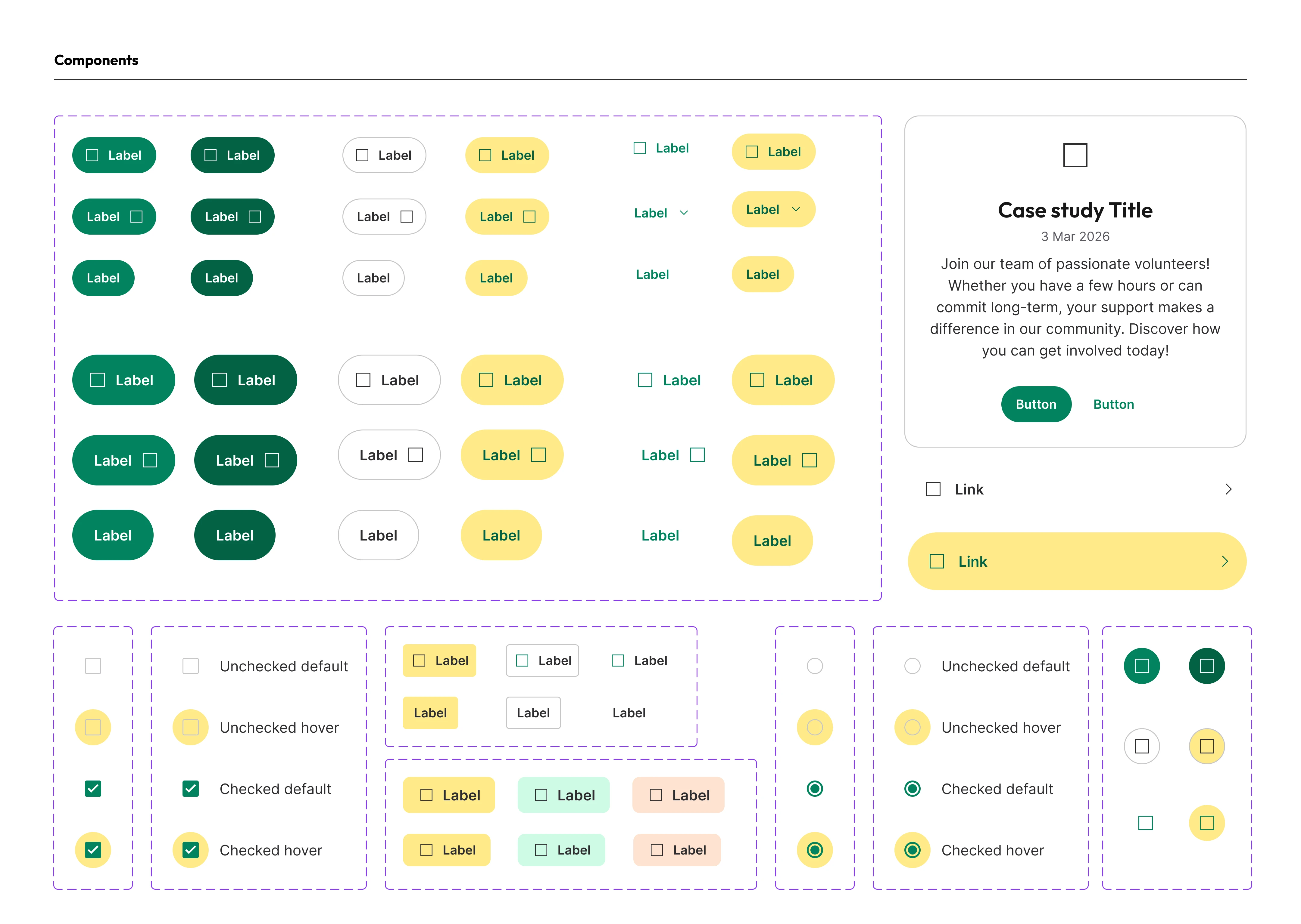
Design System for CMS independence
I established the design system from layout foundations to reusable components so new pages scale.
Research Process
/How I defined the solution
3.1
Analytics: Finding out where the problem is
I analysed five GA4 reports given from the client to understand user behaviour, acquisition channels, device split, and retention patterns.
3.1
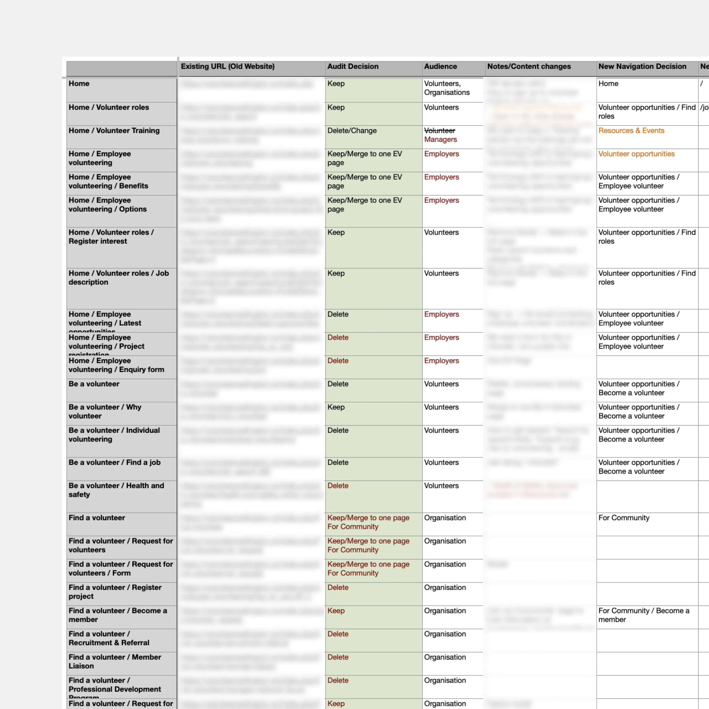
Content inventory
I created a content inventory table and worked with the client to classify each page as Keep, Delete, or Merge. The goal was to find out what needs to stay to make the site manageable for staff and findable for users.
3.2
Cross referencing the user journey: Finding the flow
I started by translating the client's user journeys into user flows, mapping how each audience would move through the screens. This made it clear where the site was creating unnecessary friction.

3.3
High-fidelity prototyping
With a tight timeline, I moved to high fidelity early to show how the design would feel. Presenting to the client at the high stage let us validate the structure and the visual direction before development.

Visual Design
/Brand Refresh
3.1
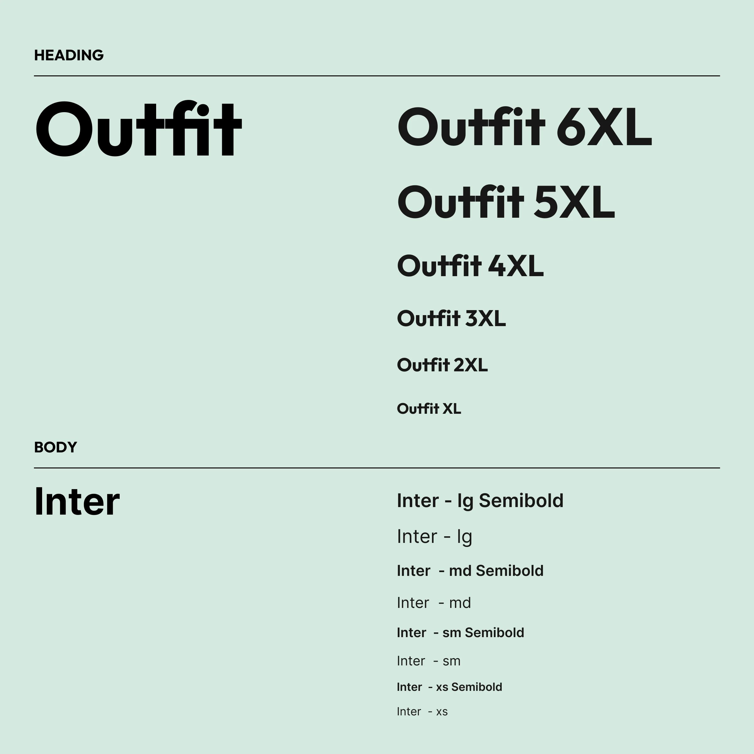
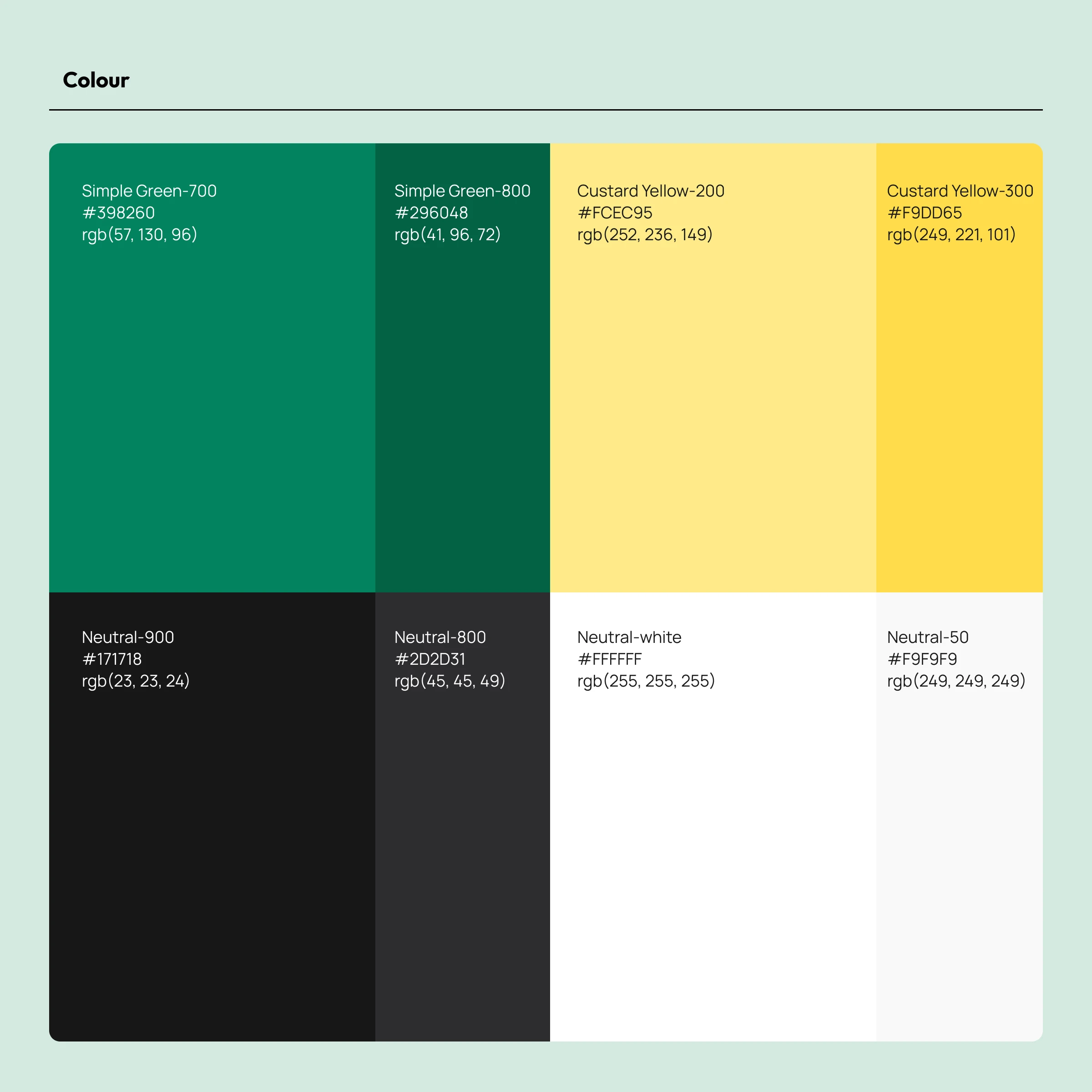
Making volunteering feel approachable
The old site felt institutional. The community it serves is warm, energetic, and diverse and the website brand need to reflect the vibe. I refreshed the visual look to feel warmer, more approachable, and community-driven.