Sorry! This project is under NDA. Please enter the passcode to view.
F&P myMask: An in-app scan that lets patients size their own CPAP mask
ORGANISATION
Industry
Skills
Team
Timeline

<20% →
20
20
%
0
0
%
0
0
+
Context
/Overview
1.0
An opportunity to rethink manual sizing through a remote approach.
The traditional CPAP mask sizing process requires patients to physically visit a clinic and try on multiple masks manually. This process is time-consuming, frequently results in inaccurate fits, and leads to high rates of wasted, discarded masks.
The opportunity of this project is to allow patients to size their own mask at home by scanning their face with their phone camera.


1.1
Outcome
By the final round of testing, most patients could complete both scans(front and nasal) on their own.
%
Task completion rate
Per F&P Healthcare's usability testing protocol, 80% task completion was required to approve
%
Conversion rate
Patients who completed both the front-camera and nasal/rear-camera scans without skipping out partway through
> 91
%
Sizing accuracy.
The sizing can only happen when patients complete a clean scan on their own, which is what the usability fixes were solving for.
1.2
My role
As the UX/UI designer, I worked from initial concept and high-fidelity prototyping. I managed 9 complete cycles of usability testing, writing the moderator scripts, running sessions, and turning tagged friction points into specific design changes.
Usability Testing
UX Research
Mobile UI Design
Interaction Design
Prototyping
Cross-functional Collaboration
Final Outcome
/Core flows
Questionnaire: Discover Perfect Mask
Patients answer questions about their sleep habits and preferences.
A simple questionnaire design lets patients focus on one question at a time and get results fast.
Mask Selection: See, Compare, Choose
Lets patients browse recommended options at a glance.
Clear image of masks help users quickly identify and select the mask that feels right for them.
Mask Sizing: Get Sized in a Minute
Step-by-step guidance walks patients through face scanning with real-time visual feedback.
Sizing complete animation made with AE


Order Completion
Sizing results instantly transmit to the DME for order fulfillment.
See management tool to know how it works.
Ongoing Support
Patients add their mask to unlock personalised support videos for fitting, cleaning, and troubleshooting.
Discovery
/Finding the requirements and restrictions
2.0
Translating clinical requirements into a scan
I worked with engineering to translate clinical sizing requirements into what the scan actually needed to capture and, in turn, what the interface needed to guide patients through.
Requirements & Restrictions
What is different from other scan tools?
1
Needs to capture a front-face view and a nasal/profile view.
2
For accurate measurement, the phone has to be on exact angle, distance, and position.
3
Size accurately across a broad range of face shapes and sizes.

Early Concept & Validation
/Exploring first concept and understanding the failure
3.0
Starting with a frame
Designing a face frame for face alignment
01/03
Core Idea
Users would align their face within a designated outline on screen.
Rationale
The design referenced the "frame alignment" mental model which is a concept users are already familiar with from other apps.

Example of 1st concept for inital testing
Early User Testing & Validation
This concept was built into a functional prototype with basic on-screen instructions and tested with real users. I led the usability test, looking into the completion rate, and following up with questions.
Task Completion
<20
%
negative Sentiment (N=20+)
58
%
Participants got frustrated and the had bad experience.
Key insights:
Problem with reading the guide instructions
Text left room for interpretation; patients needed something more accurate
→ A visual illustration could show the correction
Iteration and Refinement
/Understanding where it failed and looking into refinements
3.1
Replacing static instructions with illustrations & animation
Transitioning from static frames to dynamic visual guidance.
Animating the instructions to guide movement
02/03
Core Idea
I worked on animations to demonstrate the how the phone should be moving. Users would observe a visual animation then replicate the movement themselves.
Rationale
60,000x Faster Processing
65% Visual Learners
Research shows illustrated instructions can improve comprehension by up to 98% compared to text alone.

Animation demonstrates → Camera: User follows
Supporting animations created in AE, Lottie
Task completion
53
%
From <20%
Negative Sentiment (n=30+)
47
%
-11% improved
Moderate improvement from 58% in the previous round.
Key Insights:
The Infinite Loop
For certain instructions, patients were unsure when to stop because the UI lacked a clear completion state.
→ Needed clearer visual feedback to confirm correct user positioning.
3.2
Building real-time, responsive feedback
Real-Time Responsive Feedback
03/03
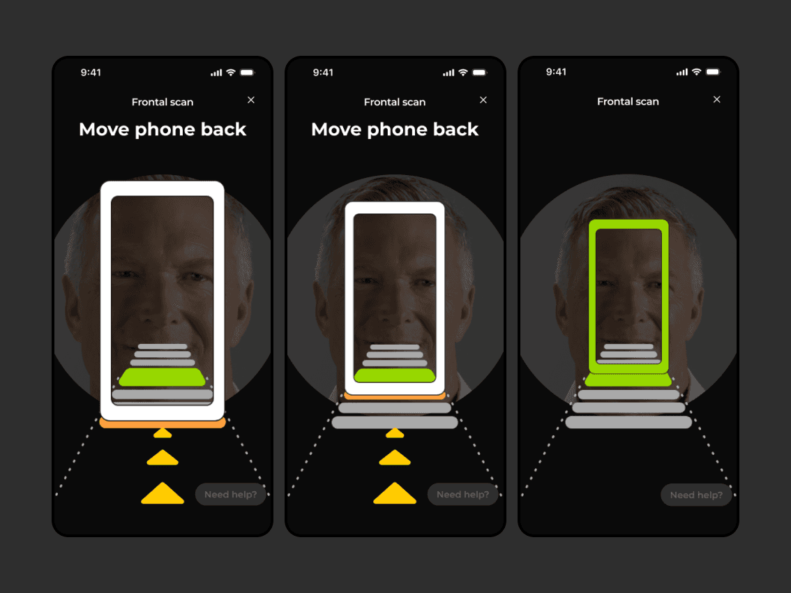
A third concept replaced pre-recorded animations with a dynamic, game-like interface.
Core Idea
I pivoted from a passive way to a real-time interactive UI. Instead of simply watching, the UI reacts directly to the user’s actions.
Rationale
Without clear feedback, users are confused when to stop. The live colour change indicates gave patients that missing signal.

Prototypes made in 'ProtoPie' integrated with angle variables.


Final Validation
I conducted a final round of usability testing to validate the design's effectiveness.
Task completion
94
%
From <53%
Most of the users were able to complete the scan.
Negative Sentiment (n=30+)
11
%
-36% improved
Sharpest improvement of any round tested.
Key Feedback from final validation:
Speed
Most patients could easily complete the task within a minute, reducing delays in decision-making and speeding up the process.

Projects

