Sorry! This project is under NDA. Please enter the passcode to view.
F&P myMask Portal: A centralised CRM portal for DME staff
ORGANISATION
Industry
Skills
Team
Timeline

Context
/Overview
1.0
DMEs lacked a dedicated platform to manage mask fitting, inventory, and order fulfillment.
DMEs play a critical role in placing CPAP masks in patients' hands and supporting their long-term care.
The myMask ecosystem enables this journey by connecting provider workflows directly to patient tools. They let patients get CPAP mask via myMask app and this requires a DME-initiated invitation and follow-up.
The platform empowers DMEs to manage inventory, track process progress, and provide timely care once scan results are returned.
The goal was to design a CRM portal that could support DMEs to manage the process of getting a patient CPAP mask, and the ongoing relationship.

1.2
Outcome
I worked on a cohesive B2B2C ecosystem that synchronised DME workflows by connecting management tools with patient digital touchpoints.
Setting New Model
New: Digital Workflow
Aligned With F&P's Stated Goal
Built for a Live Ecosystem
1.3
My role
I worked through flow charts and diagrams to figure out how patient sizing data needed to move between the myMask app and the portal, and used the structure to decide what the dashboard needed to show and how.
System Mapping
UI Design
Stakeholder Facilitation
Final Outcome
/Core Flows
1. Organisation Card Setup: Building Trust & Brand
DMEs create a profile card with their logo, name, and contact details that would appears on the patient's app. This provides professional brand presence and builds trust.
2. Invite a Patient: Customised Invitations to myMask app.
DMEs send invitations to the patient with configured mask options to match their stock availability or physician prescriptions.
3. Invitations Table: Real-Time Status Tracking
DMEs monitor all patient invitations in one centralised view. The table displays patient details and invitation status for quick action and follow-up.
4. Patient's Mask Request: Managing Orders
Displays the patient's selected mask and size from the myMask app, allowing DMEs to organise and ship the correct mask.
5. Mask Configuration: Creating Reusable Presets
DMEs build reusable template options based on insurance coverage, ensuring patient choices match both active inventory and clinical eligibility.
Discovery
/Research & Mapping
2.0
Mapping the ecosystem
I participated in workshops with UX, product, sales reps, and software developers to map how patient, order, and branding data needed to move between the portal and the myMask app.
As a result of the workshop, I put together a flow chart, an IA, and a swimlane diagram, which helped the wider team align on how the portal needed to work and surface exactly where it needed to sit between the app, DME staff, and F&P's systems.


Flowchart showing how it integrates with the app
2.1
Customer User Journey
Customer user journey helps to see the full path a patient takes from noticing symptoms to reaching a DME, and where the portal's role begins.

2.2
Information Architecture
Information Architecture helps to see how the portal's data and features needed to be structured before designing any screens.

2.3
Swimlane Diagram
Swimlane Diagram helps to see the interactions between DME staff and patients, identifying touch points.

Design Evolution
/Design & Iteration
3.0
Designing high-fidelity screens, then iterating on what stakeholders raised
I designed high-fidelity screens so stakeholders could review something close to the real product, then worked through a few iterations to refine key features based on their feedback.

3.1
Navigation Reorganisation

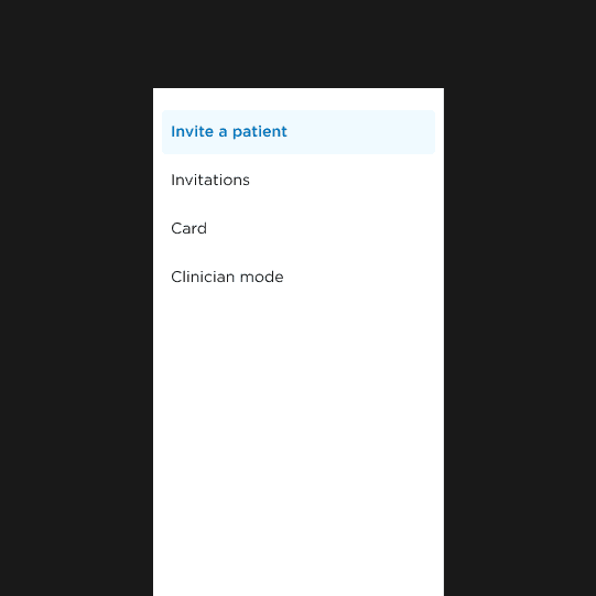

Before
• Mixed patient and admin functions
• Orders buried in patient list
After
• Split navigation: patient workflows vs. admin
• Moved orders into dedicated menu
Rationale
Give clearer categorisation to reduce cognitive load and highlights critical actions
Form Refinement


Before
Single-page form with no inventory visibility
After
• Improved grouping
• Embedded inventory preview
Rationale
Information chunking reduces cognitive load and provides stock visibility during setup.
Better Organisation Contact Card


Before
No preview capability
After
• Org-level branding setup
• Ability to preview
Rationale
Centralised setup reduces redundant data entry while preview eliminates launch uncertainty.

Projects
More Portfolio
We follow a clear process to keep every step simple, structured, and easy to manage.

